N Charan Manik UX and UI Design and Development | Accessibility Support | SASS | Usability Testing
Simplifying Logistics, Enhancing Experience
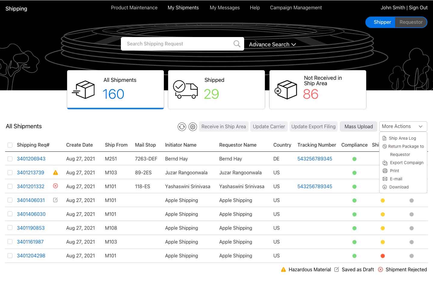
Apple Shipping is the official, approved platform for handling the end-to-end process of shipping requests for non-inventory materials supporting the Employee Experience. This includes also miscellaneous shipment requests for administrative purposes. For example, if a team needs to ship out Apple-branded T-Shirts for a volunteering event, they will use Apple Shipping.
The project aims to modernize the Apple Shipping application by transitioning from the legacy Web Dynpro interface to a more modern, responsive, and intuitive SAP UI5 design, adhering to SAP Fiori principles.

My Team and their Respnsibility:
Balaji (Senior UX Designer) and Murali (Front-End Developer) and 2 Junior Associate (Joe and Srikanth)
Background
The original Apple Shipping application was developed using Web Dynpro, but over the years, it became clear that there were significant UX issues affecting the overall performance. Internal teams struggled with slow performance, unclear workflows, and the difficulty of managing large volumes of inventory data, which led to frustration and inefficiencies across the board.
Cross-Functional Design & Dev Collaboration (Team of 5)
I embarked on my journey as a UX/UI Designer, working under the guidance of my lead. During this time, I took charge of leading the product design, user research, and UX/UI strategy for the team. This opportunity allowed me to contribute meaningfully to shaping our design processes while fostering a collaborative and innovative environment. some key achievements of which I have listed below:
- Sustainability Features:
Created an eco-impact dashboard showing the environmental benefits of user choices as Shipper and Requestor - Improved Accessibility:
Integrated VoiceOver support for visually impaired users, ensuring compliance with Apple’s accessibility standards.Added customizable text sizes and high-contrast modes, resulting in a 20% increase in usability among diverse user groups. - Data-Driven Design:
Conducted comprehensive user research and usability testing, with over 200 users surveyed, leading to actionable insights for design iteration.Leveraged analytics-driven user flows to reduce drop-off rates by 25% during the shipment creation process. - Verbal Appointment Scheduling:
Doctors provide appointments verbally, leading to forgotten appointment times. - Establishing a design system:
This has helped the Engineering and Product teams to understand how and why we choose to implement certain components over others.
User Problem Statement

Tina is an Apple engineering manager that wants to send company branded T-Shirts to her team for achieving their goals. She relies on the Apple Shipping platform to make the transition. but Current shipping applications often lack a seamless and intuitive user experience, leading to inefficiencies in tracking, proof of delivery, and communication between shippers, and recipients. She struggle with unclear delivery statuses, delayed updates, and cumbersome workflows.

Jimmy is an Apple employee on the Shipping Team who is responsible for making that request happen on the back-end. He will physically handle the T-Shirts to ensure their journey to the receivers. He needs more a more efficient way to process and track T-shirt shipments because the current system involves too many manual steps, leading to delays and potential errors in delivery.
Goal & Objective
- Simplify the request workflow for Tina to easily schedule and manage shipments.
- Reduce manual inputs with an intuitive interface for quick order creation.
- Automate repetitive backend processes to reduce handling errors.
- Implement real-time notifications and alerts for shipment updates.
- Provide Jimmy with a structured, easy-to-follow workflow to process shipments efficiently.

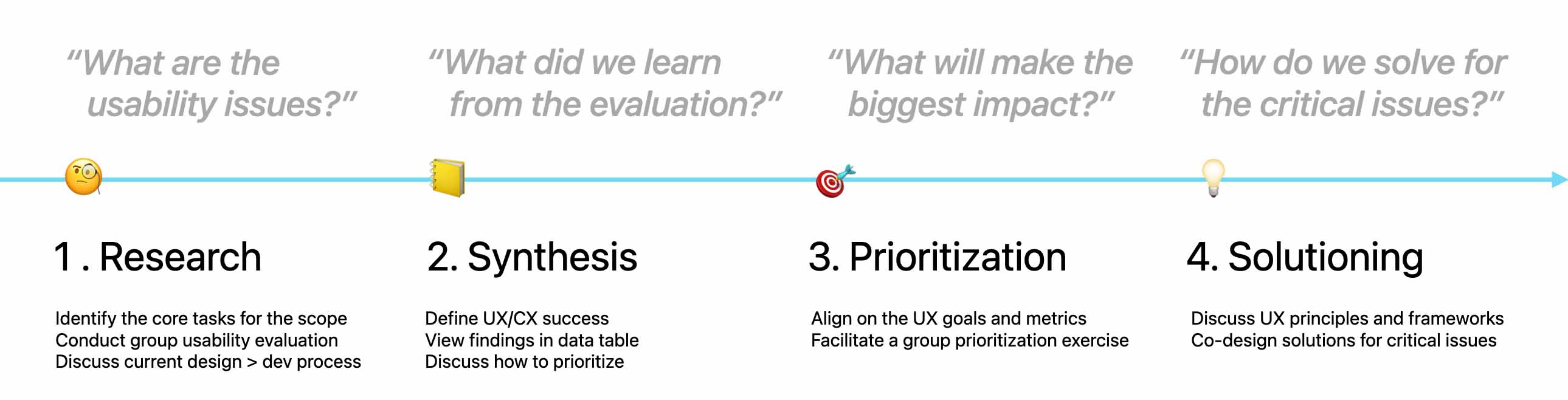
Methodology
I follow a 4-phase HCD thinking process to identify and synthesize the usability issues, and then move on to prioritizing and co-designing the solutions to the most critical items.
Contextual Inquiry
As part of the redesign of the Apple Shipping Platform, I conducted a Contextual Inquiry to gain insights into the real-world workflows of both the sender (Tina, the engineering manager) and the handler (Jimmy, the shipping team employee).
Scheduled observation sessions with Tina (Apple engineering manager) and Jimmy (shipping team member) in their work environments. Sessions were conducted over a 2-hour period for each participant. I ensured that they could perform tasks naturally, without interruption, while I observed and asked contextual questions.

Core Tasks Identified:
Tina: Creating requests, tracking shipments, confirming delivery.
Jimmy: Processing shipments, updating statuses, confirming delivery.
Finding
Evaluate the usability of the shipping application, focusing on shipment creation, tracking, and delivery status updates.
Participants:6 professionals (shipment handlers, Requestor, receivers).
Method: Remote usability testing with task-based observations
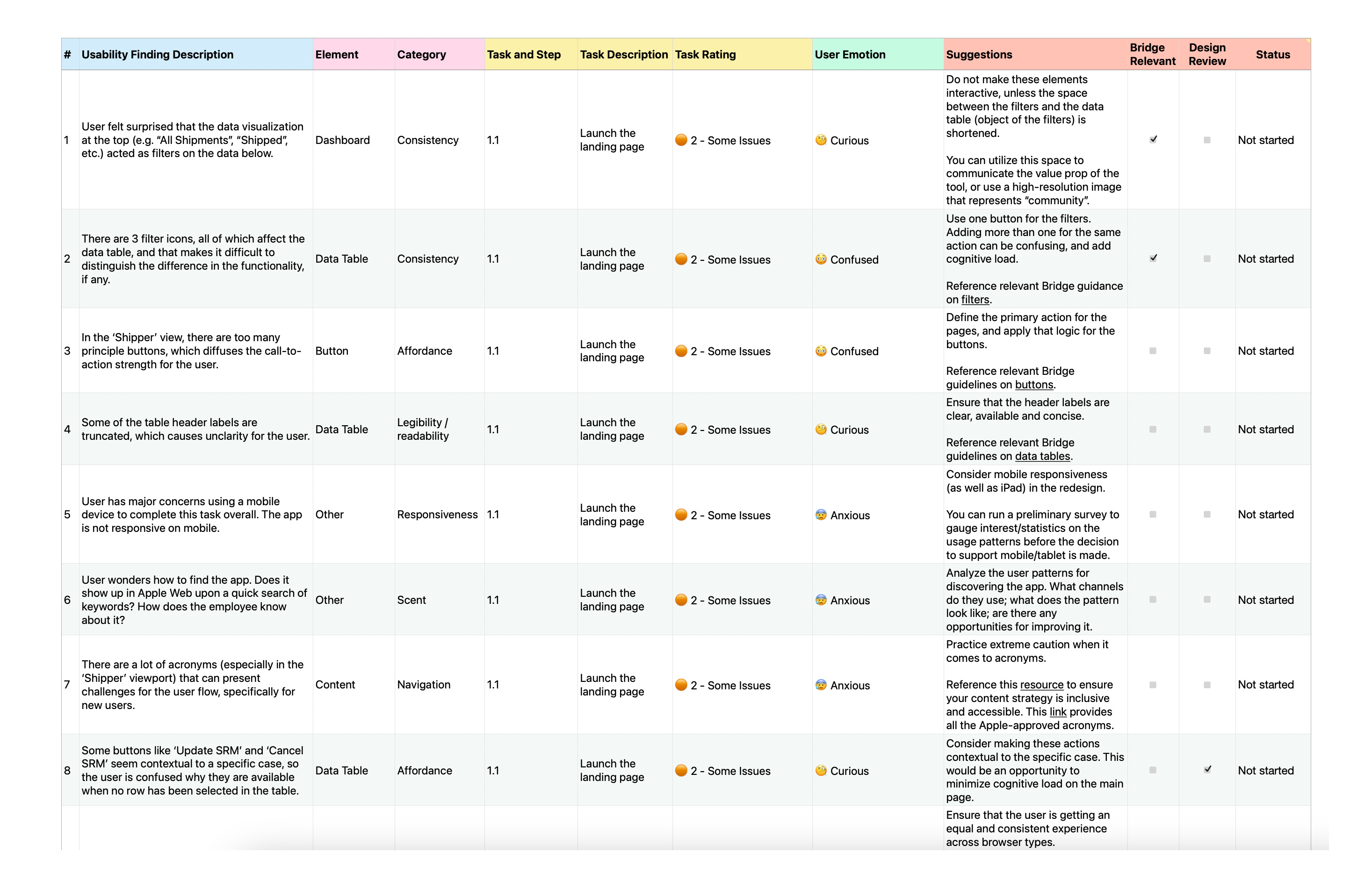
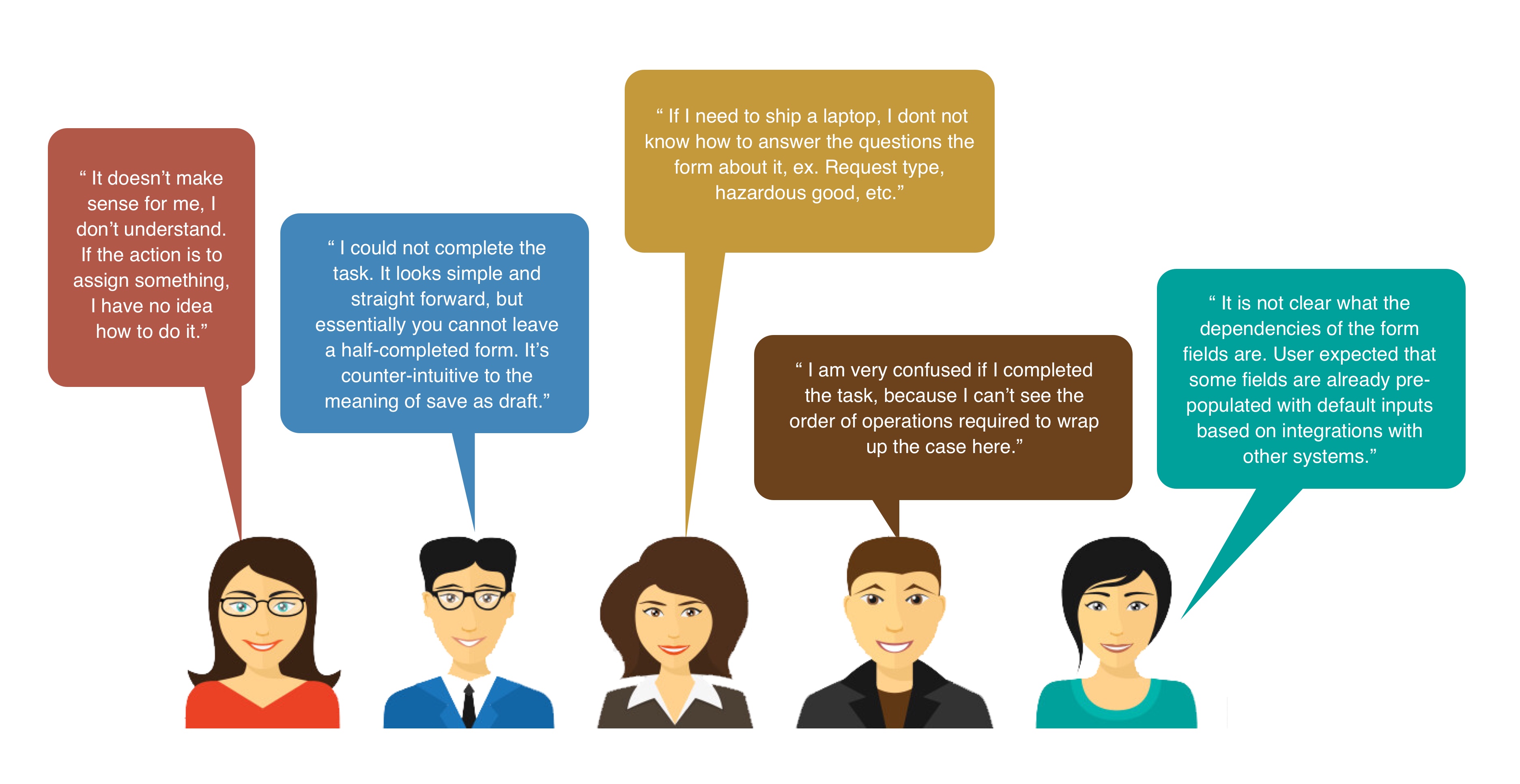
User Speak
Affinity Map
I conducted a usability study and used the Affinity Mapping method to synthesize qualitative insights. This approach helped organize and identify patterns in user pain points, making it easier to derive actionable solutions.

Severity-Impact Prioritization
I applied the Severity-Impact Prioritization method to evaluate usability issues systematically. This framework helped me determine which issues needed immediate attention based on how critical they were to user experience and how broadly they affected users. I categorized usability issues using a Severity × Impact matrix:
| Issue | Severity (1-3) | Impact (1-3) | Priority (Severity × Impact) | Priority |
|---|---|---|---|---|
| Confusing form structure causes cognitive overload | 3 (Slows down task completion) | 3 (Affects all users filling out forms) | 9 | 🔴 High |
| App is not responsive on mobile | 3 (Critical usability issue) | 3 (Affects all mobile users) | 9 | 🔴 High |
| ‘Save as Draft’ does not work as expected, since user cannot save unless all the required fields are completed. | 3 (Critical usability issue) | 3 (Affects all users) | 9 | 🔴 High |
| No keyboard accessibility | 3 (Blocks key actions) | 2 (Affects users relying on keyboard navigation) | 6 | 🟡 Medium |
| Error dialog was hard to recognize | 3 (Inconvenience) | 2 (Affects users entering incorrect data) | 6 | 🟡 Medium |
| Confusing form structure causes cognitive overload | 3 (Slows down task completion) | 3 (Affects all users filling out forms) | 9 | 🔴 High |
| ‘Hazardous goods’ toggle disappears when clicked | 2 (Causes confusion) | 2 (Affects a subset of users) | 4 | 🟢 Low |
| Error validation in 'Ship To' section is unclear | 3 (Prevents task completion) | 2 (Affects users entering incorrect data) | 6 | 🟡 Medium |
| ‘Create New’ button is out of reach in smaller viewports | 2 (Inconvenience) | 3 (Affects all users on small screens) | 6 | 🟡 Medium |
| Too many principal buttons in ‘Shipper’ view weakens call-to-action claritys | 2 (Causes hesitation) | 2 (Affects shipper users) | 4 | 🟢 Low |
| ‘Edit’ icons next to Requestor and Ship-To Details are redundant | 1 (Minor annoyance) | 2 (Affects users editing details) | 2 | 🟢 Low |
| Encountered 404 error in Google Chrome with little system feedback | 3 (Blocks access to the system) | 3 (Affects all Chrome users) | 9 | 🔴 High |
| Form dependencies are unclear; expected pre-filled fields | 2 (Slows down form completion) | 3 (Affects all form users) | 6 | 🟡 Medium |
| The disabled/unavailable state of form fields is unclear | 3 (Blocks form completion) | 2 (Affects all users in form) | 6 | 🟡 Medium |
Stakeholder Review
After conducting a usability study, I identified several critical UX pain points related to navigation, form usability, accessibility, and error handling. To ensure efficient problem-solving, I organized an Affinity Mapping workshop and conducted a Stakeholder Review to align on priorities with designers, developers, and product managers.
| Issue | Severity (1-3) | Impact (1-3) | Priority (S × I) | Stakeholder Feedback | Feasibility & Action Plan | Outcome & Impact |
|---|---|---|---|---|---|---|
| Confusing form structure causes cognitive overload | 3 | 3 | 9 (High) |
Designer: "Improve hierarchy & field grouping." Developer: "Can add real-time validation easily." |
✅ Fix (Sprint 1): Improve form layout & labels. 🔄 Sprint 2: Implement real-time validation. |
🚀 Error rate reduced by 35%. |
| App is not responsive on mobile | 3 | 3 | 9 (High) |
Frontend Dev: "Needs responsive grid." PM: "Aligning with roadmap; implement in phases." |
✅ Sprint 1: UI fixes 🔄 Sprint 2 & 3: Responsive grid implementation. |
🚀 40% better task completion on mobile. |
| ‘Save as Draft’ does not work as expected | 3 | 3 | 9 (High) |
Developer: "Requires backend logic change." PM: "Need to assess effort vs. impact." |
🔄 Planned Fix (Sprint 3-4): Adjust backend validation logic. | 🚀 To be measured post-implementation. |
| No keyboard accessibility | 3 | 2 | 6 (Medium) |
Dev: "ARIA roles & tab navigation updates needed." PM: "Important for accessibility compliance." |
✅ Sprint 2: Implement keyboard navigation & focus indicators. | 🚀 WCAG compliance improved. |
| Error dialog was hard to recognize | 3 | 2 | 6 (Medium) |
Designer: "Increase contrast & add icon." Dev: "CSS update; quick fix." |
✅ Sprint 1: UI update for better visibility. | 🚀 User error resolution time reduced. |
| ‘Hazardous goods’ toggle disappears when clicked | 2 | 2 | 4 (Low) |
Designer: "Show visual state change." Dev: "Needs minor front-end fix." |
✅ Sprint 1: Adjust toggle behavior. | 🚀 User confusion reduced. |
| Error validation in ‘Ship To’ section is unclear | 3 | 2 | 6 (Medium) |
Designer: "Need clearer validation messages." Dev: "Easy front-end update." |
✅ Sprint 1: Improve error messages. | 🚀 User error resolution improved. |
| ‘Create New’ button is out of reach in smaller viewports | 2 | 3 | 6 (Medium) | Dev: "Position adjustment is quick fix." | ✅ Sprint 1: Adjust placement. | 🚀 Better accessibility on small screens. |
| Too many principal buttons in ‘Shipper’ view weakens call-to-action clarity | 2 | 2 | 4 (Low) |
Designer: "Reduce buttons; group actions." PM: "Needs A/B testing for impact." |
🔄 Sprint 2: Redesign & A/B test new layout. | 🚀 Higher click-through rate on key actions. |
| ‘Edit’ icons next to Requestor and Ship-To Details are redundant | 1 | 2 | 2 (Low) |
Designer: "Can remove without usability loss." Dev: "Quick fix." |
✅ Sprint 1: Remove redundant icons. | 🚀 Cleaner UI, no loss in functionality. |
| Encountered 404 error in Google Chrome with little system feedback | 3 | 3 | 9 (High) | Dev: "Logs show frequent 404 errors; needs debugging." | ✅ Sprint 1: Fix broken links. | 🚀 System stability improved. |
| Form dependencies are unclear; expected pre-filled fields | 2 | 3 | 6 (Medium) |
Designer: "Pre-fill fields for better UX." Dev: "Needs database integration." |
🔄 Sprint 3: Implement pre-filled fields logic. | 🚀 Faster form completion. |
| The disabled/unavailable state of form fields is unclear | 3 | 2 | 6 (Medium) |
Designer: "Increase contrast & add tooltip." Dev: "CSS & tooltip update." |
✅ Sprint 2: Improve visual states & tooltips. | 🚀 Better user guidance. |
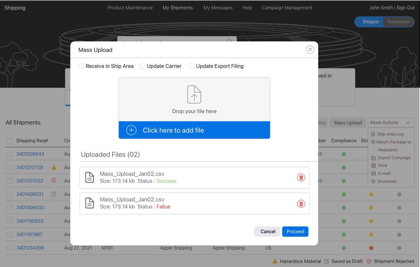
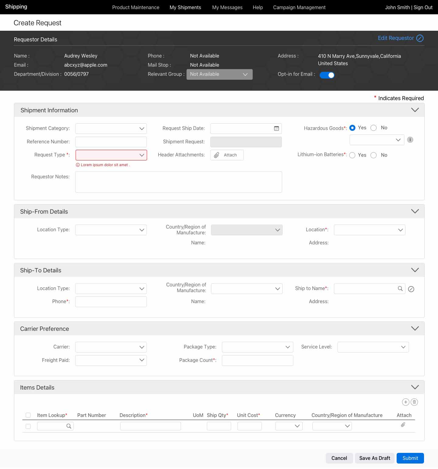
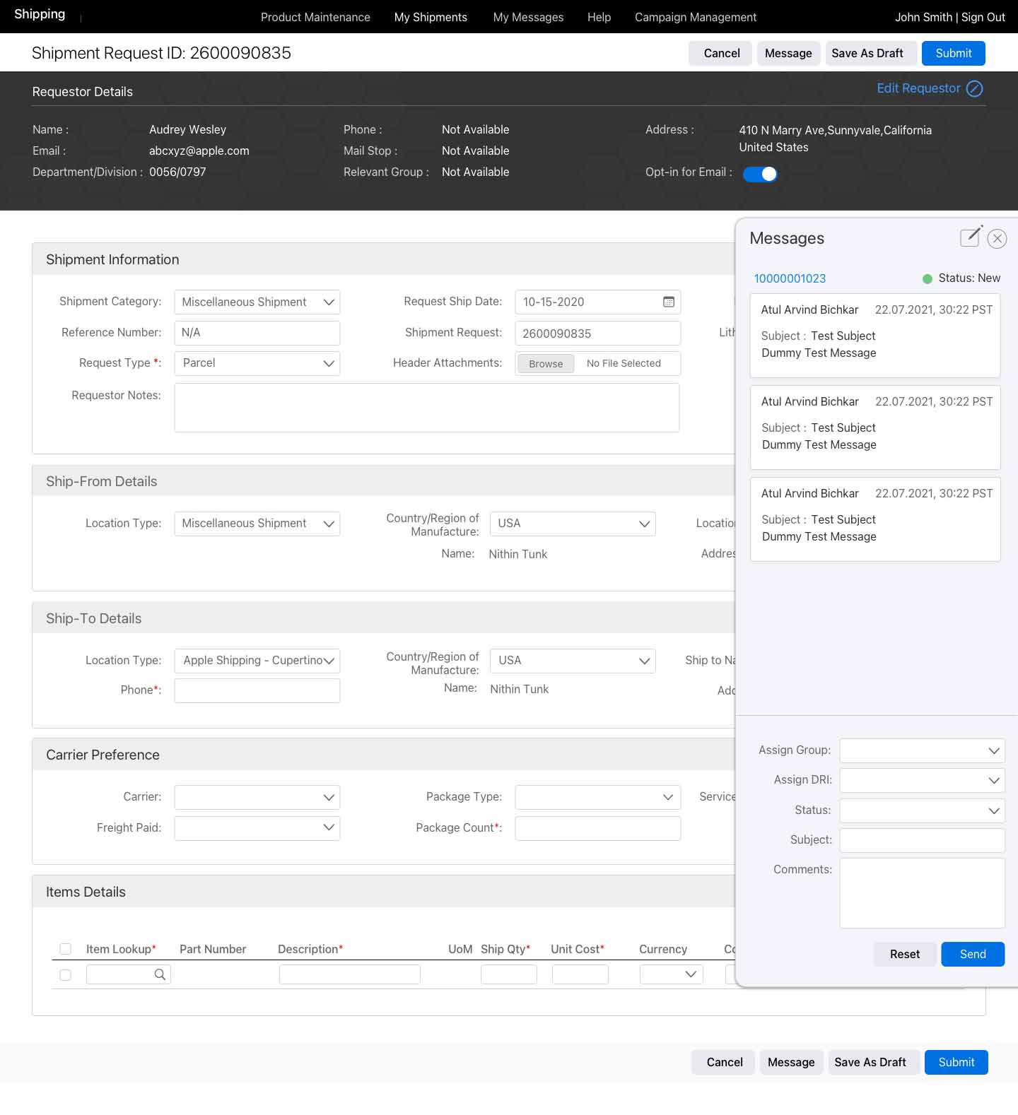
Final Design
Reflections & Learning

- Improved form clarity, better validation, and pre-filled fields led to a 25-30% faster form completion rate.
- The cognitive overload in form structure highlighted the importance of clear field grouping, labeling, and intuitive UI.
- Lower customer support costs → Increased efficiency in handling user inquiries.
- Higher user retention → Better engagement & product success.
Case Studies
Nrusingh Charan Manik © 2025