N Charan Manik UX and UI Design and Development | Accessibility Support | SASS | Usability Testing
Powering Businesses with Seamless Solutions.
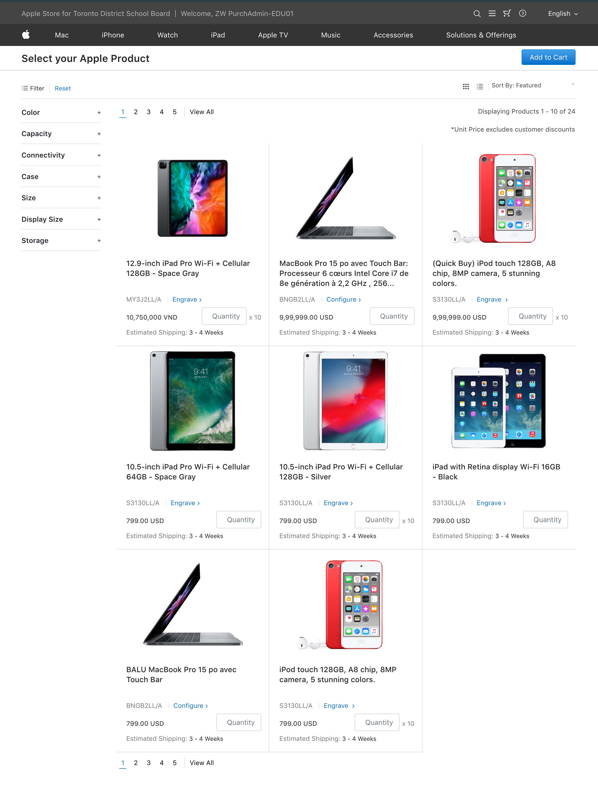
Before 2024 Users had to go through multiple menus and subcategories to find the right product. There was no clear categorization or quick search functionality.By the start of 2024, A more structured menu and clear product categorization were introduced, reducing the number of clicks needed to find a product and Users could now save frequently ordered products or create custom lists for easier reordering.
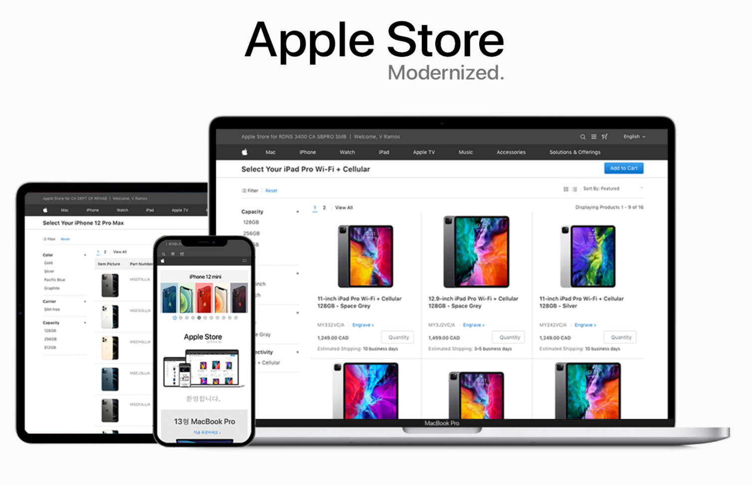
I was part of an ambitious project to revamp the user experience for the fastest-growing B2B eCommerce platform for Apple, aiming to improve usability, efficiency, and overall customer satisfaction.
To comply with my non-disclosure agreement, I have omitted and obfuscated confidential information in this case study. All information in this case study is my own and does not necessarily reflect the views of Apple.

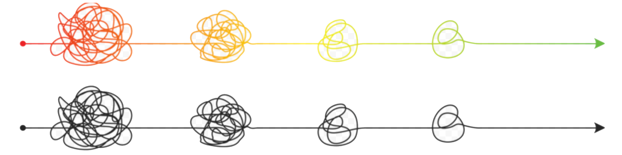
Design by accretion
In just one years, B2B eCommerce platform for Apple evolved from a niche service to a leading solution. By 2025, the platform is expected to support thousands of businesses with streamlined procurement processes across multiple industries.
The Application - designed in 2014, the platform faced challenges in scaling alongside the rapid business growth. The initial design struggled with usability, as complex workflows and inefficient ordering systems hindered user experience.
To address these challenges, a major redesign was undertaken to optimize the user experience, improve accessibility, and ensure the platform could scale efficiently with the growing demand.
Problem & Objective

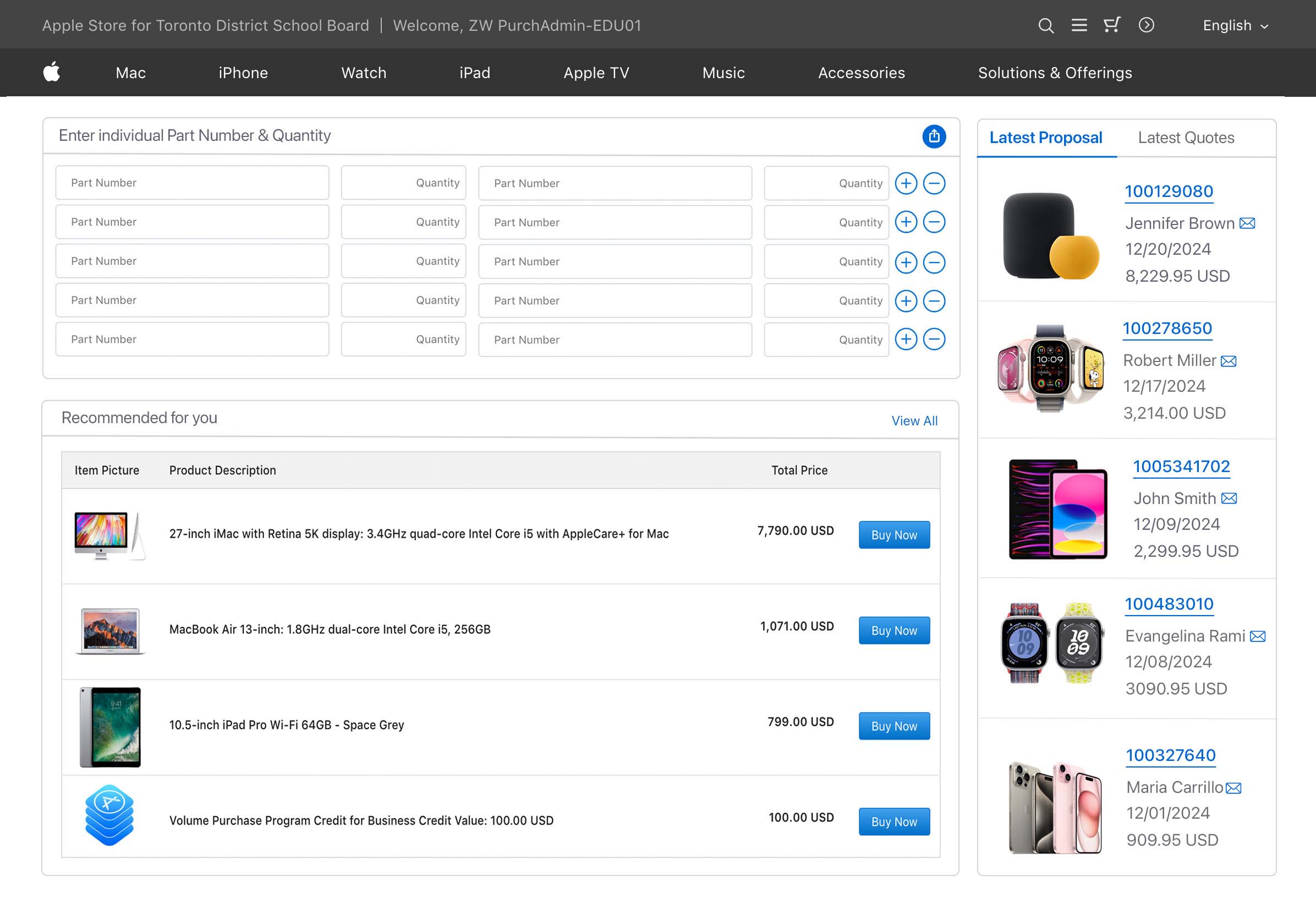
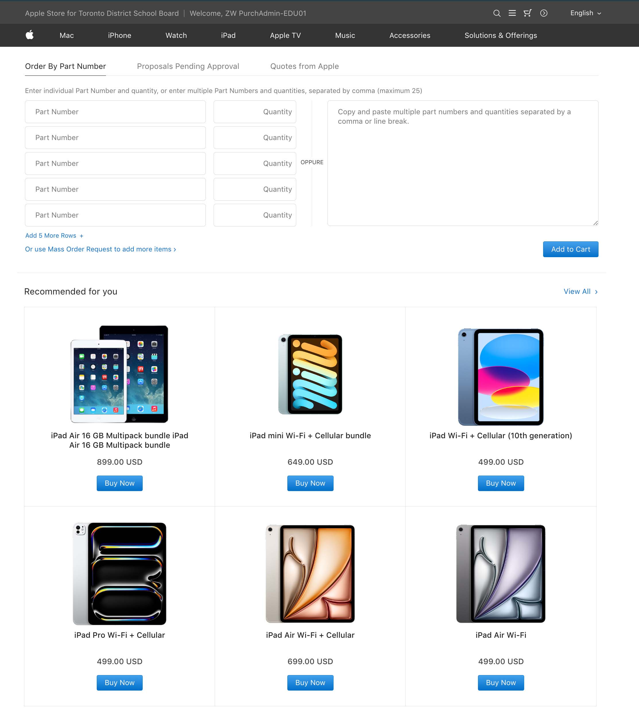
A procurement manager faces challenges with the platform's bulk ordering system, which lacks features like bulk upload and repeat order functionality. This requires manual item selection, leading to errors and slowing down the process.

To design a user-friendly B2B e-commerce platform that helps IT personnel manage device procurement and integration seamlessly. Improved navigation and support will enable efficient order management, setup, and issue resolution, reducing setup time and enhancing IT operations.
Status quo
75% of users are NOT satisfied with how current portal supports their business needs.
The experience is complex and requires a significant amount of time to learn before users can realize its value.
Methodology & Goals
Usability Audit
User Interviews
Personas
Jobs to be done
Usability Audit and User interviews were conducted to learn about user pain points and existing gaps in customer portal. Personas were developed and concise problem statements were crafted following JTBD framework.
Research Goals
- Understand the specific challenges & frustrations users face
- Discover how users interact with the application in their daily workflows
- Discover what features & functionalities users expect
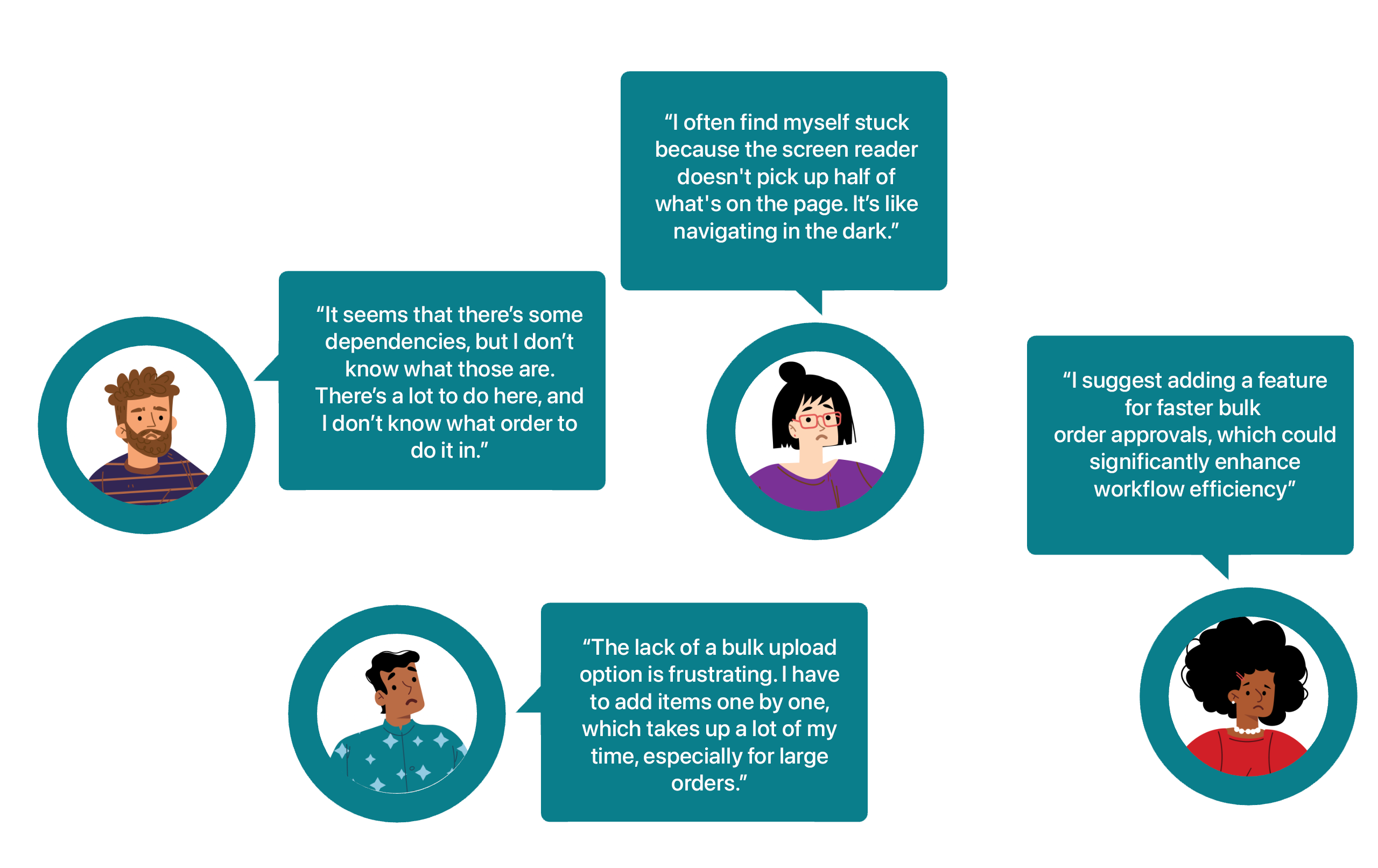
User Pain Points
Interviews with 7 Internal stakeholders and 3 External users. Users with Disabilities: 3 out of 10
Usability Audit
7 out of 10 Users find the bulk ordering system inefficient, leading to errors and delays, particularly for those managing large-scale procurement.
Insights
6 out of 10 users are less inclined to use the platform regularly and may seek alternative solutions which a need for improvements to enhance user engagement.
Workflow
8 out of 10 Users Difficult navigation and inadequate search functions slow down the process of finding products or features, impacting user productivity.
Accisibility
3 out of 3 Users with visual impairments or color blindness struggle with low-contrast elements, making it hard to read text and identify interface components.
User Speak
Surprising Behaviors
View Content
7 out of 10 users constantly zoom in & out or scroll excessively to view content or complete actions.
Export
6 out of 10 users frequently export data to external tools for better control over reporting and analysis.
Resolve
5 out of 10 users regularly contact customer support for issues they believe they should be able to resolve on their own.
Resolve
5 out of 10 users regularly contact customer support for issues they believe they should be able to resolve on their own.

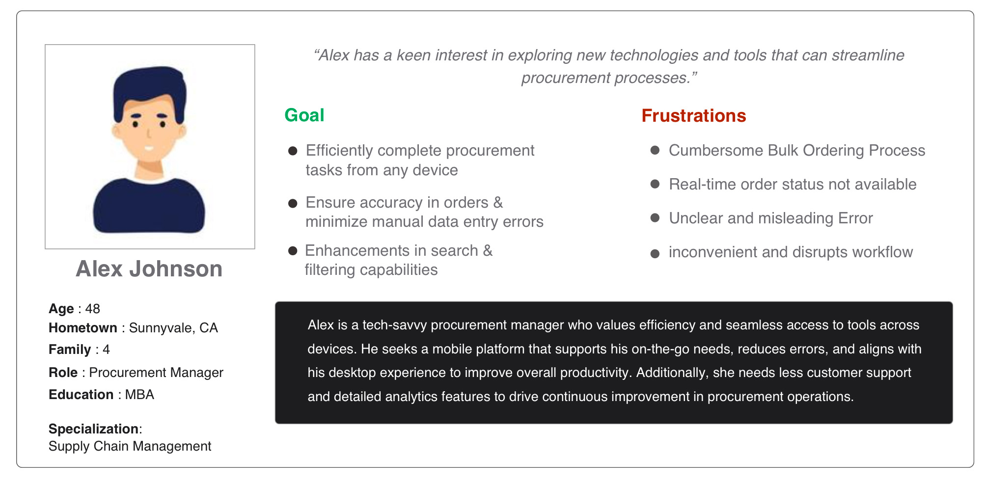
Persona: Alex
Problem statement: Alex is responsible for purchasing and managing devices and equipment for his company's workforce. He frequently places bulk orders and coordinates with various departments to ensure timely procurement. With a busy schedule and frequent travel, Alex relies heavily on mobile devices to manage his tasks on the go.
Persona: Joe
Problem statement: Joe is a operations manager who oversee the day-to-day operations of the B2B store. He ensure efficient order processing, inventory management, and logistics and collaborate with other departments to streamline operations and improve service delivery.

Jobs To Be Done (JTBD)

Refining Processes for Better Performance
- Improving procurement
- Ordering product feature
- Improve navigation & search
How can I improve procurement, ordering, and navigation for a more efficient user experience?
Enhance Visual Appeal & Streamline Product Interaction
- Sleek & Visually Engaging Interface
- Sorting product filter
- Simple Features, Fewer Errors
How can I create a clean, intuitive interface that streamlines product sorting and minimizes errors?
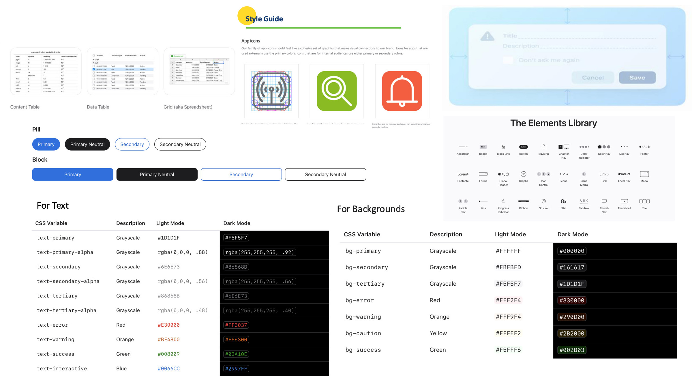
Accessibility Standards
- Adjust color schemes
- Enhance screen reader support
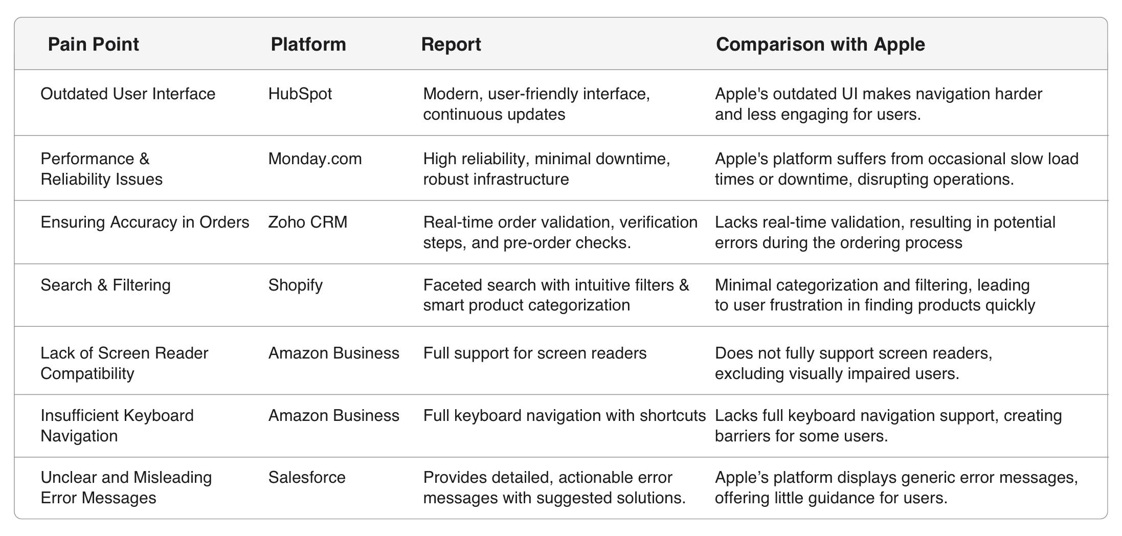
Competitor Analysis
Analysis focus on how competitors handle similar challenges
Design Challenge
Since, the quantitative study was inconclusive, I conducted a qualitative study. It revealed some confusion on v2. For example: Quick Links’ was difficult to understand in context.
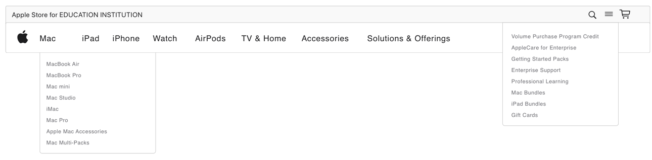
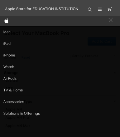
I put together a hierarchy based on two approaches: Category vs Tasks.
V1 (Tasks)
- Tested with 16 users
- Success score: 73%
- Directness score: 73%

V2 (Category)
- Tested with 14 users
- Success score: 80%
- Directness score: 74%
Solution
Based on the qualitative study results, I designed a Category-based IA
Web

Mob
Design Challenge
I explored three data-visualization patterns to answer the key questions gathered from user interviews.
For bulk order and review
- How do users currently input part numbers i.e manual or upload
- Are proposed approvals time-sensitive?
- What key details should be displayed?
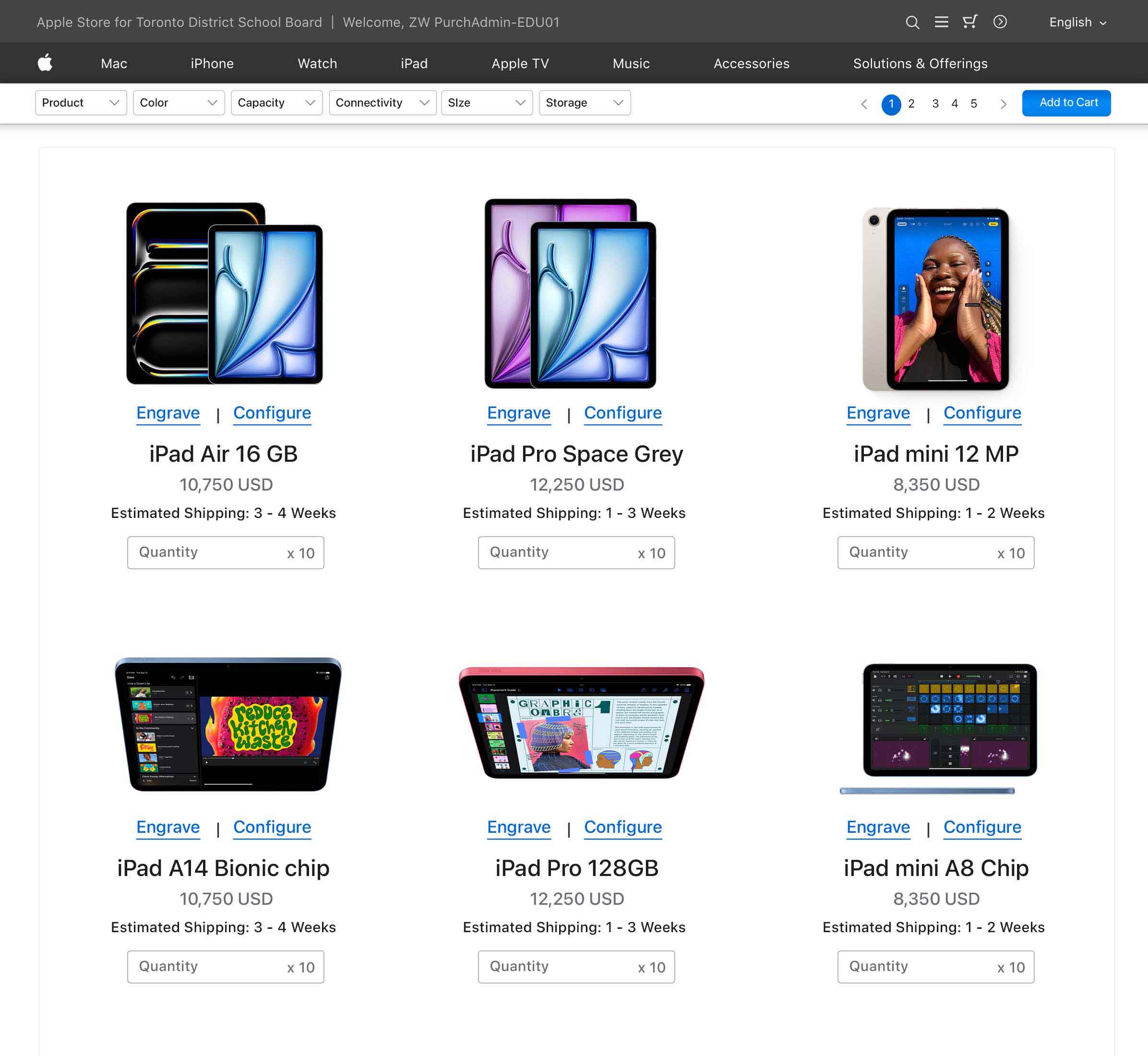
For product list
- Are they bulk-ordering or making selective purchases?
- Do i need to filter the product by availability?
- Does the user engrave the product?

I audited all features and existing data to figure out the best possible data visualization - that can provide meaningful insights.
Each data-viz posed some challenges based on the quantum and granularity of information. I wanted to pressure-test a few ideas with internal users.
Exploration
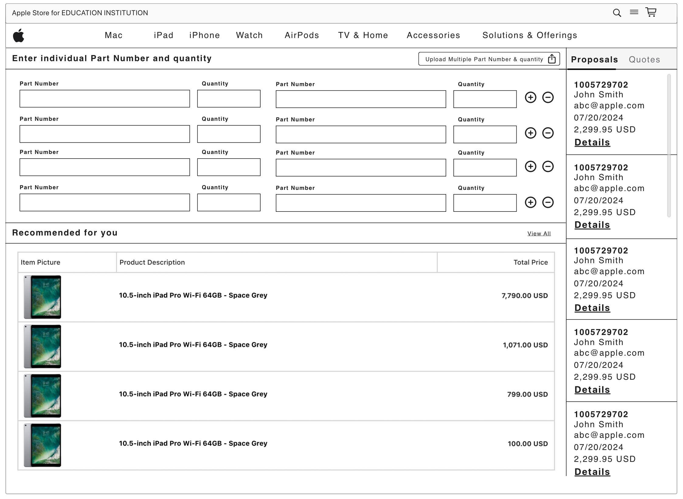
For bulk order and review:
- How do users currently input part numbers i.e manual or upload
- Are proposed approvals time-sensitive?
- What key details should be displayed?
Exploration

For product list:
- Are they bulk-ordering or making selective purchases?
- Do i need to filter the product by availability?
- Does the user engrave the product i.e online, in-store?
Usability Testing
I designed the tasks and scenarios to cover the primary
JTBD with 9 users,
and secondary JTBD with 1 user.
Following test metrics were used to measure success.
Ease of Discovery
Ease of Use
Task Completion Rate
Time on Task
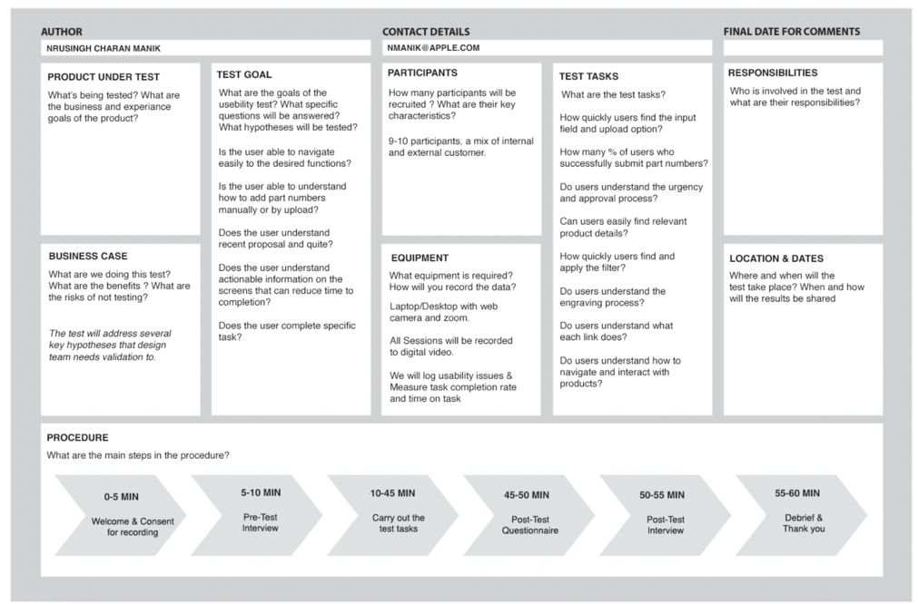
User Feedback
A moderated usability study was conducted with 10 users.
Usability Study
A moderated usability study was conducted with 10 users.
Refined Solutions
Refined Solutions
Visual Elements
Accessibility Issues
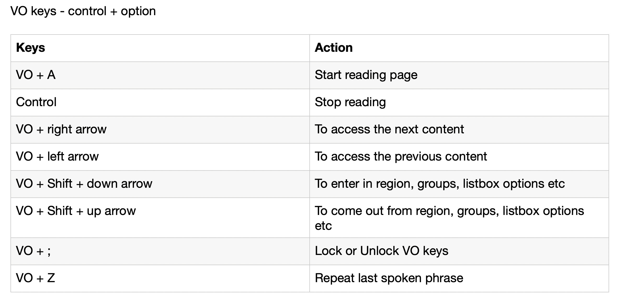
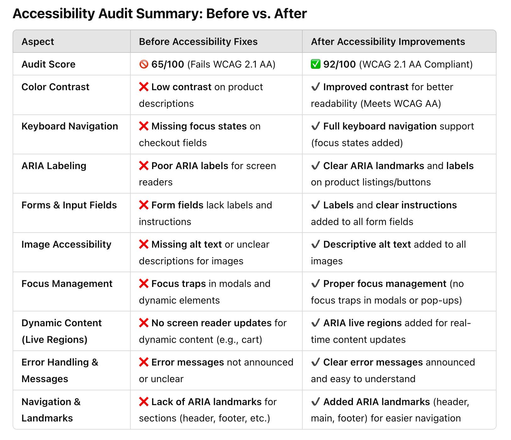
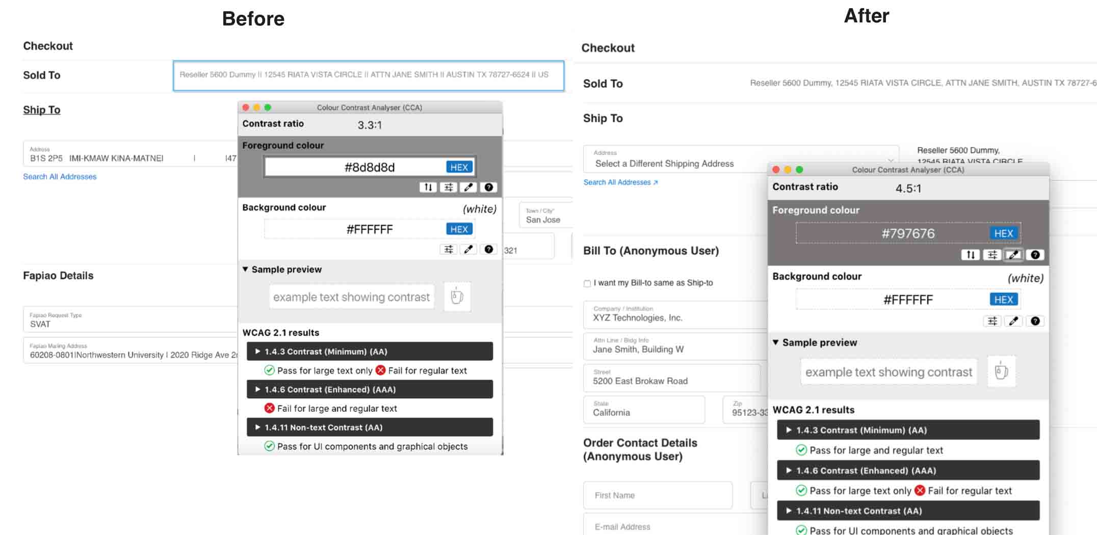
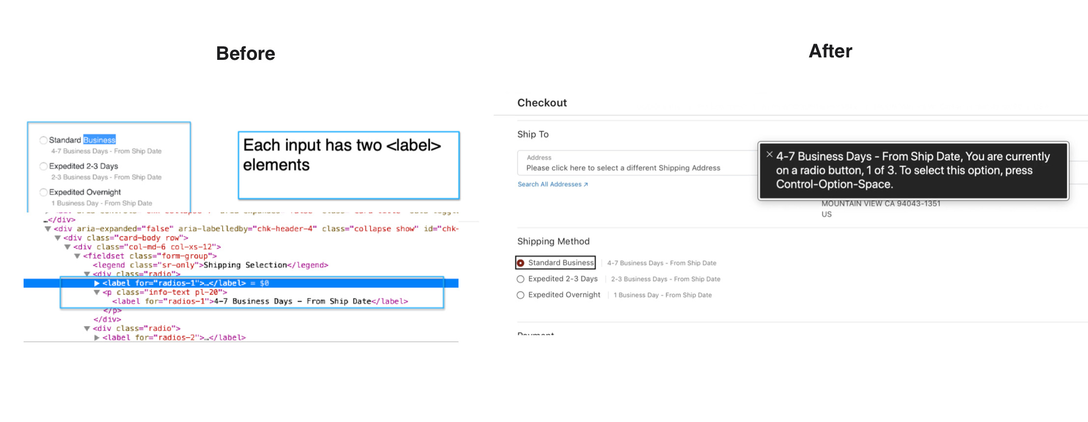
Performed an in-depth accessibility evaluation using VoiceOver, aligning with Apple's AA accessibility standards. The audit identified critical issues such as missing ARIA labels, improper focus management, inadequate color contrast, and unlabeled form elements. Implemented solutions to enhance screen reader navigation, ensure logical tab order, and improve visual clarity for users with visual and motor impairments.
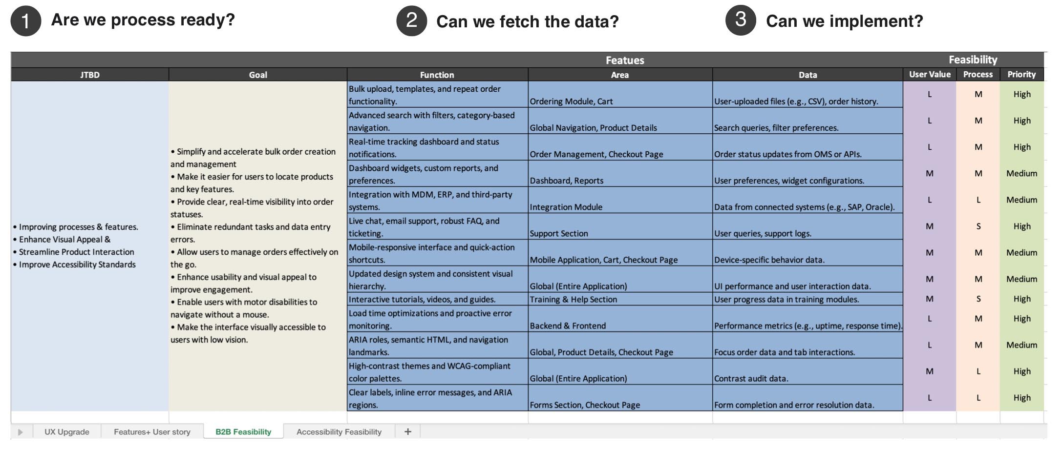
Feasibility Study
In parallel with creating mockups, I engaged the right partners early to ensure a solid understanding of the feasibility of my designs.
Highlights
Reflections & Learning

- Partnering with departments having direct client contact gives continuous insights
- Corridor tests allow to spot silly errors
- Early engagement with cross-functional partners mitigates the risk of delays
- User research using JTBD framework
Case Studies
Nrusingh Charan Manik © 2025