N Charan Manik UX and UI Design and Development | Accessibility Support | SASS | Usability Testing
Improving online delivery service experience
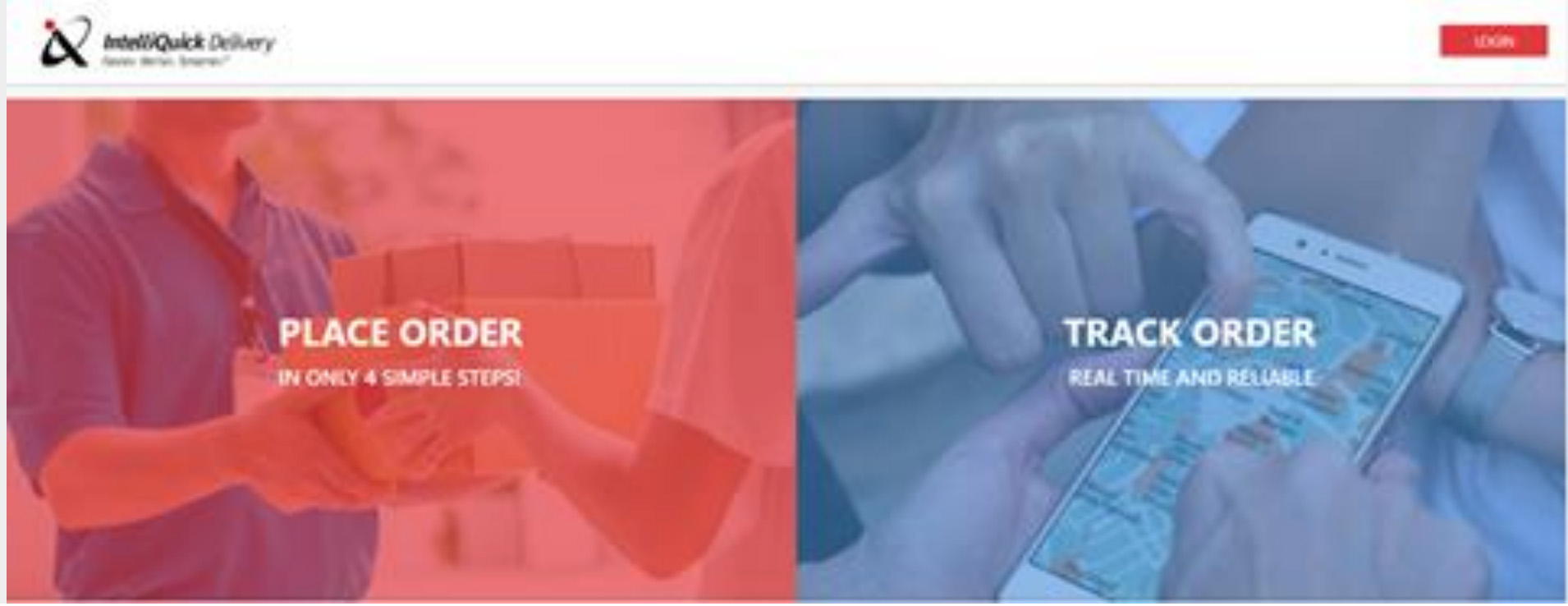
IntelliQuick Delivery is a US based delivery service, operating in United States (majorly in Southwestern US) and Canada.
It is a 15 year old company with 250+ delivery partners and clients mostly use this service for B2B deliveries.
Identifying Roles

COMMERCIAL BUSINESSES
People who use it to send parcels from company to company.
Users are usually employees of certain companies or businesses who have Billing Groups for payments.

NORMAL USERS
People who use it to send normal courier to other people for personal use.
They are secondary users of this service.
Identifying the problems
Defining Problems
Commercial industries are identified as the primary users of this service so there are few key problems we found out the users faced:
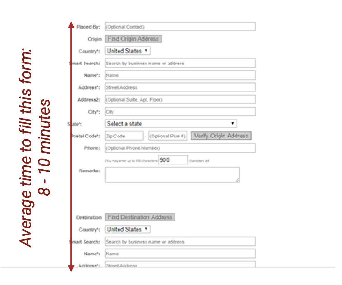
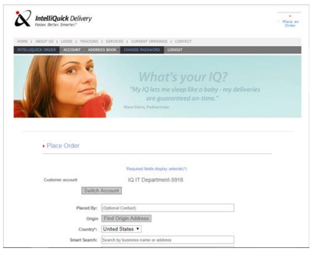
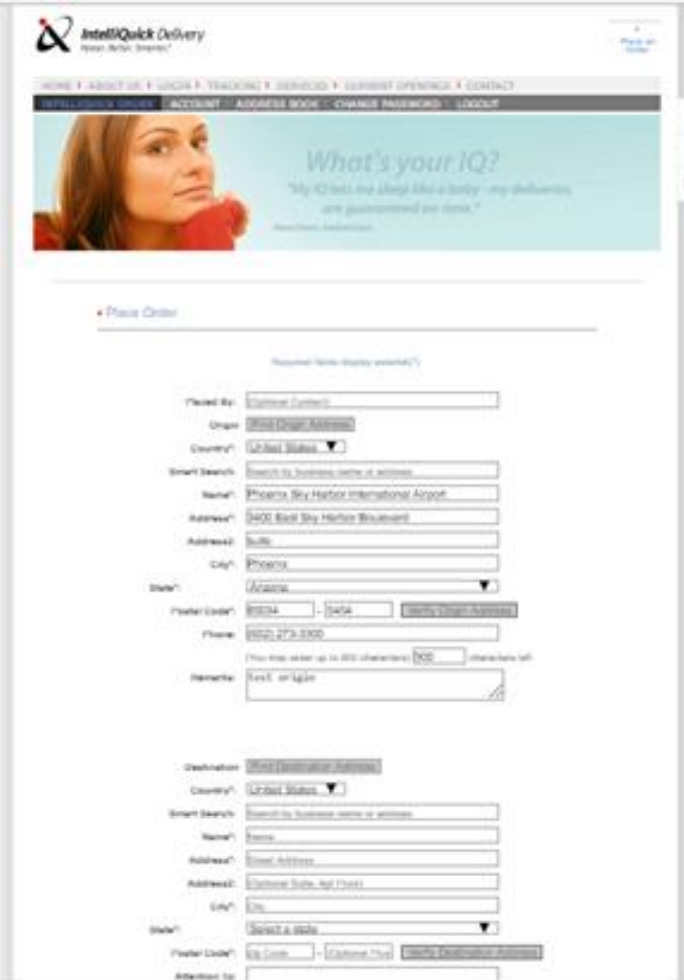
- For commercial delivery & pickup, time is the key, users had issues filling up long tiresome form with confusing layout.
- Since they are daily users, certain steps of process they don’t want to be done repetitively every time
- If users want to ‘Track’ their orders, they just want to see a glimpse of their order status quickly so they don’t want to login again and again to track something.
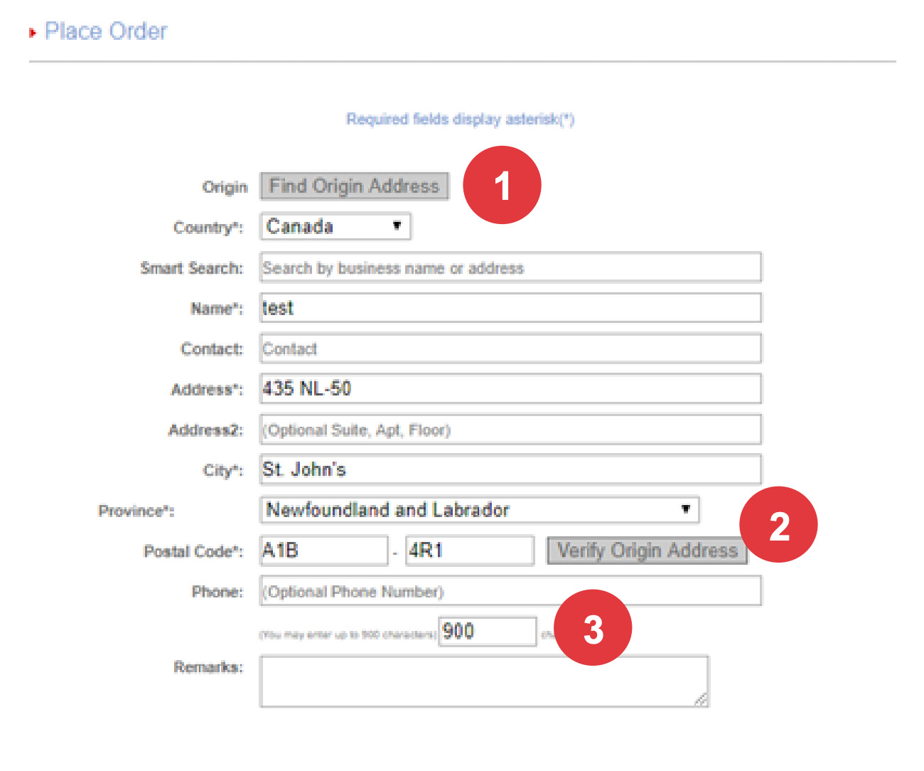
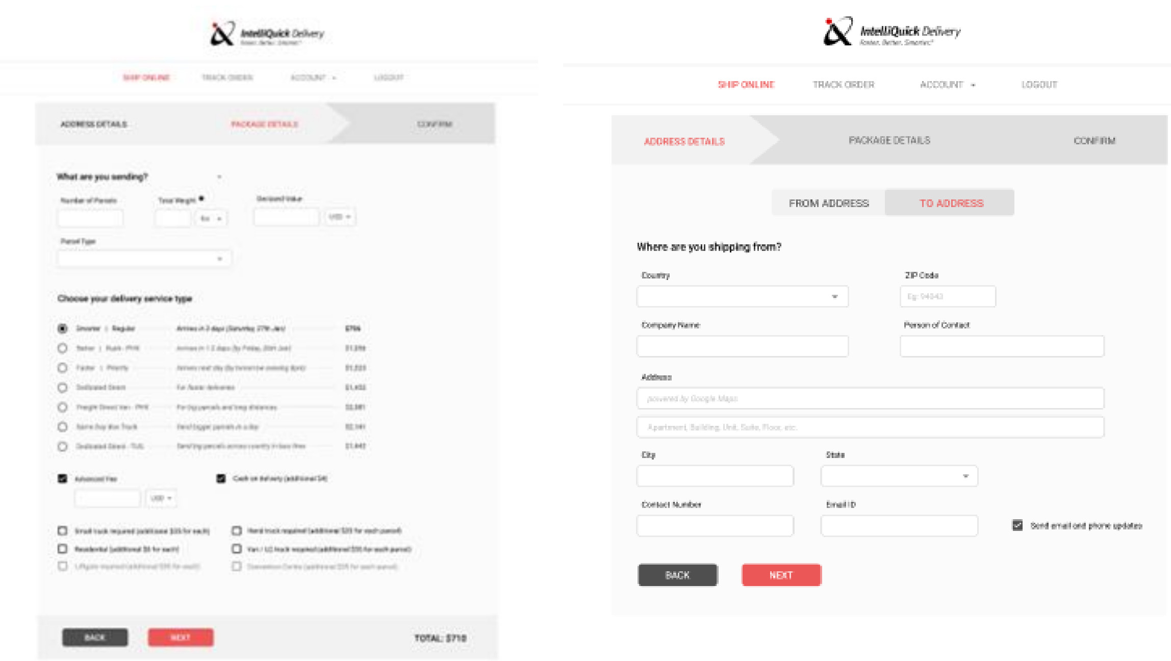
- Users have to go through 3 different fields in order to get their address correctly.
Normal people also use IQ Delivery service for, these are the problems they face:
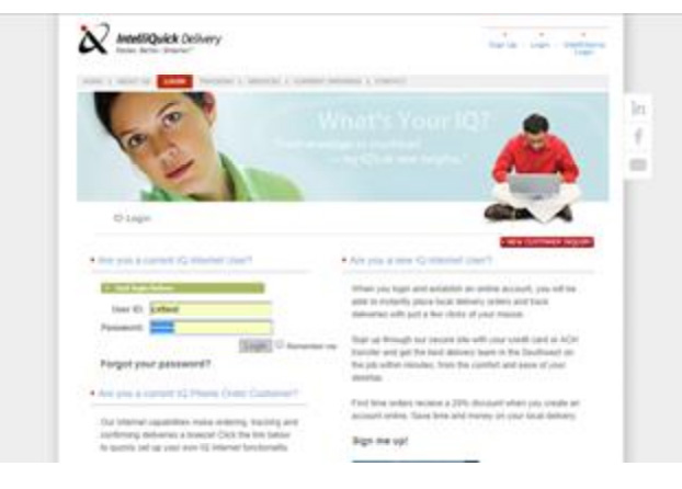
- The website lacks a clear purpose, making it hard for users to grasp its main goal. Missing CTAs further weaken user guidance and engagement.
- There is huge list of services that users find overwhelming and confusing to pick what is right for them.
- Layout is very confusing and users have to know a specific pattern of usage in order to complete their task.
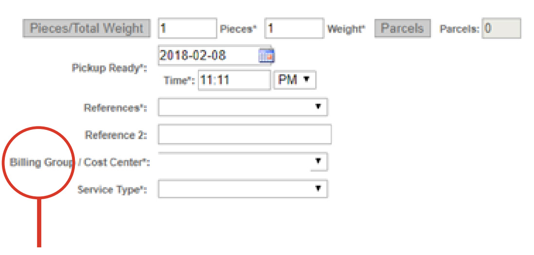
- Lot of information like (eg. barcode generated) are useless to users, it only makes the system look more complex for them.
There is no option for normal users to pay through other payment methods, they have to login via alternate way just to get other payment methods
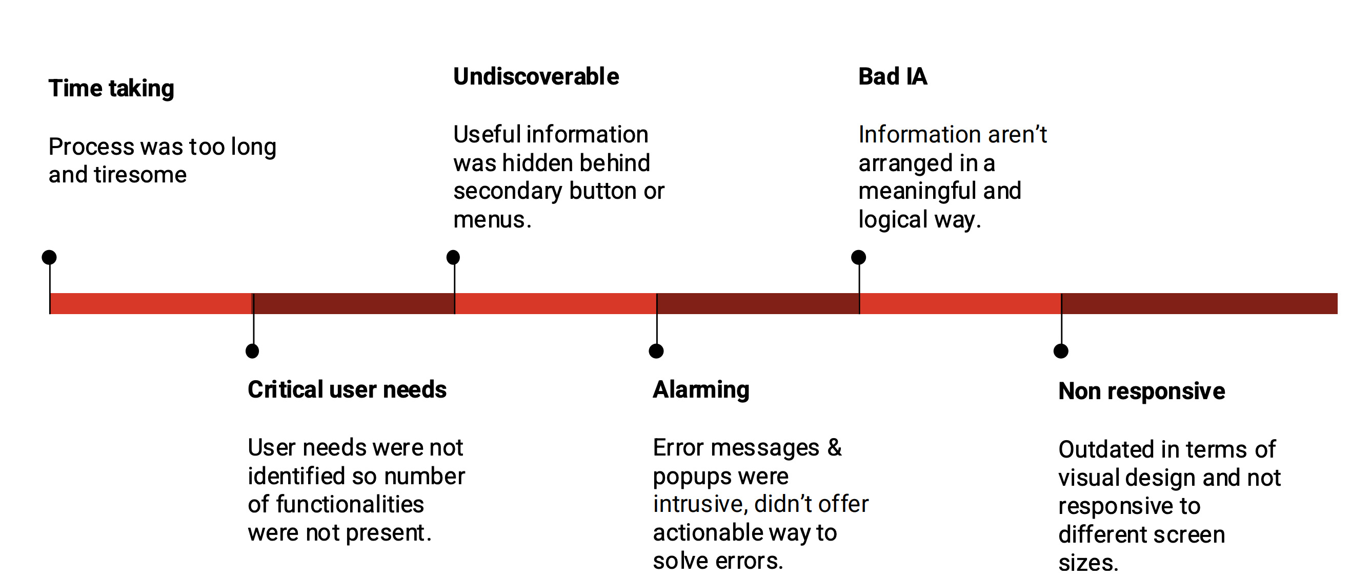
Identifying pain-points
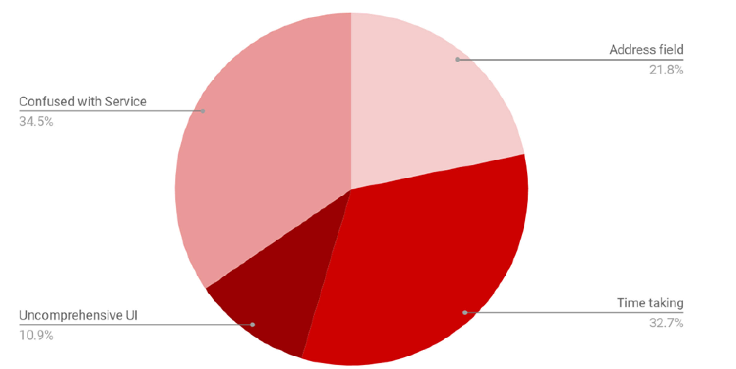
Interviews with 7 Internal stakeholders and 3 External users. Users with Disabilities: 3 out of 10
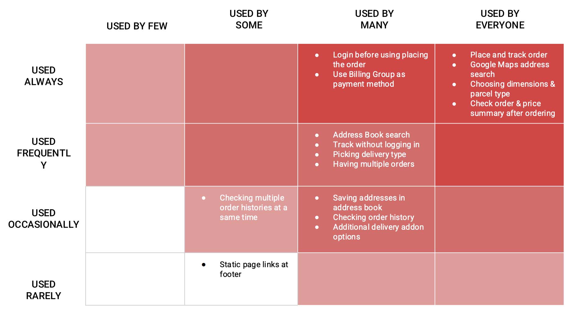
3 out of 5 users find the field identical to Smart Search, causing confusion. Lack of distinction affects usability and slows task completion. Clear labeling and visual differentiation are needed to enhance clarity.
Only 2 out of 5 users use this button to verify their address, indicating low discoverability. Users either overlook it or don’t understand its purpose. Improving visibility and labeling can enhance engagement.
3 out of 5 users, wrongly take word count limit field as a field to be filled by user because the information has given equal precedence as other fields.
4 out of 5 users, users encounter errors after clicking submit but don’t know how to resolve them. Clear error messages and guidance are needed to improve usability.
UI Problems
- The website is not responsive to different devices.
- Overall design looks blatant, boring and outdated doesn’t align to modern design guidelines.
- Current look does not serve as a trust creating factor for the user.
- There is no progress bar or wizard that would tell user about his/her progress through this long form.
Created by engineers, with no UX consulting, it hits all content requirements but not at all easy to use
- Lack of proper format and UX, leads to time taking order filling process, resulting in users to not use the service and move to alternative options
- Due to bad design, users aren’t able to finish their task and it is delaying their work.
- Bad visual design, makes it look outdated, resulting in loss of user base affecting the business!
As a result, user trust suffered and customer started migrating to other services, business went low.
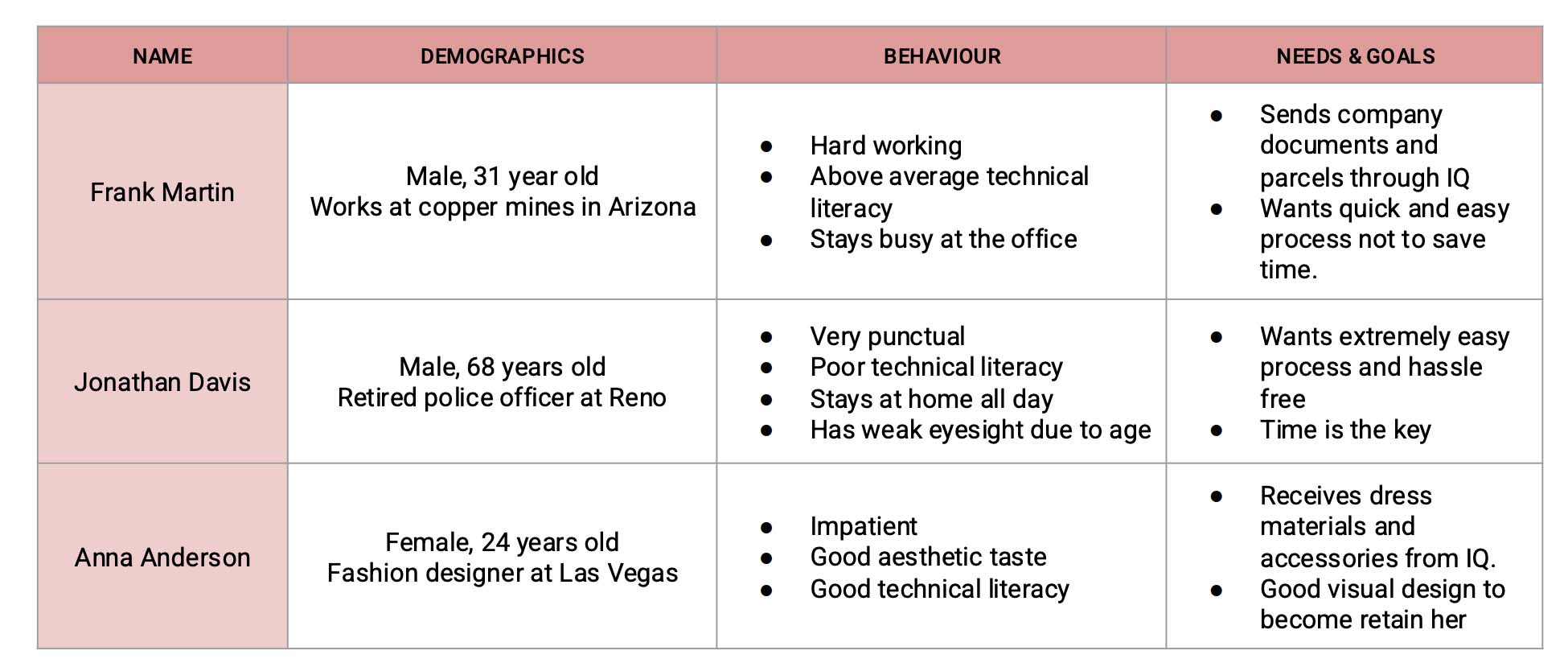
Personas
Competitive Analysis
Compared with some of the industry best delivery service companies like FedEx, UPS and TNT. Few takeaways from the competitive analysis are:
- Long forms are unavoidable but certain practices have made it appear easy and comprehensive, like use of progress bars, hiding not much used options in retractable menus, having adaptive form layouts (some menus would only show up if certain previous fields are filled).
- Use of top aligned labels: they make it easier for different sized labels and localized versions to fit easier within the UI (this is especially good for mobile screens with a limited estate).
- Common address fields are use that suggests Google Maps search queries rather than having multiple fields.
- Human friendly language used for the interface
We took some inspiration from best practices used by the leaders of industry like Fedex and UPS. We found out following:
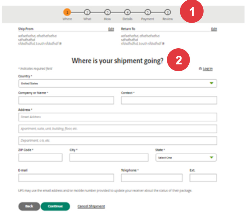
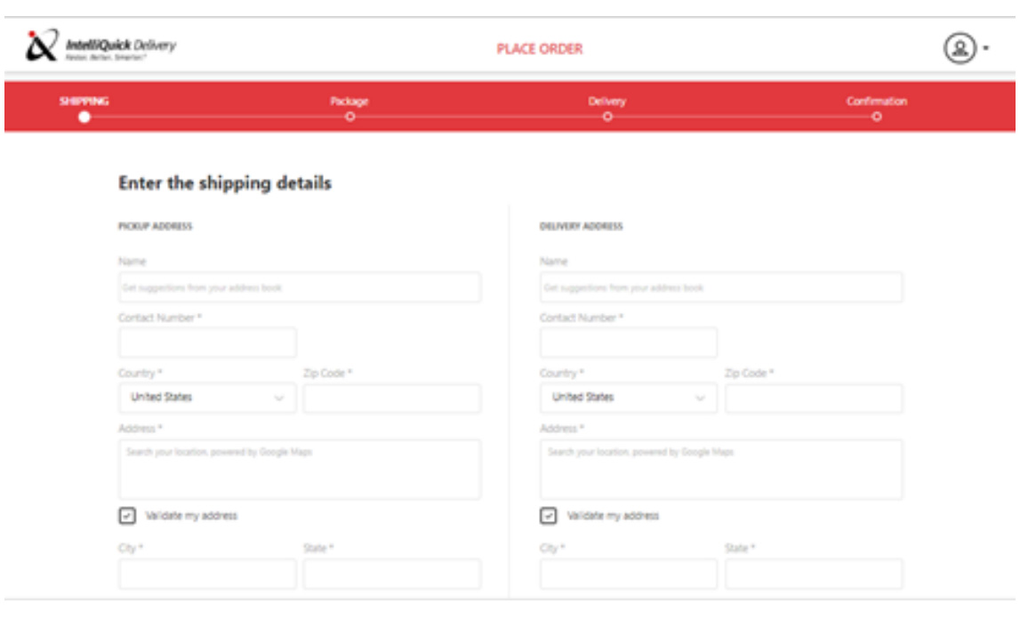
- Form has been broken down to 4 simple steps.
- There is a step indicator that tells user about his progress and how many steps he has to finish to complete his task.
- Form fields are clear and lingo is very user friendly.
Design Goals
I conducted a usability study and used the Affinity Mapping method to synthesize qualitative insights. This approach helped organize and identify patterns in user pain points, making it easier to derive actionable solutions.
Make the process clear and comprehensive.
Use a step-by-step layout with visual cues to show dependencies clearly.
Empower users to correct themselves in case of human error.
Ease down the long form filling process for users
Sketching
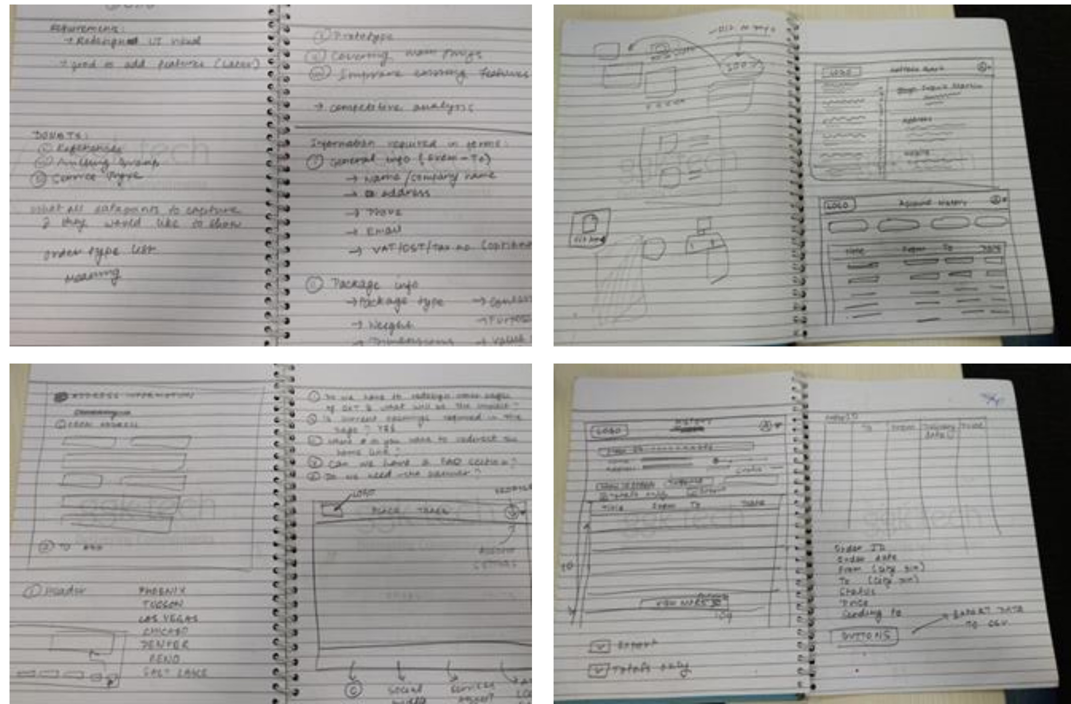
Initial design iteration
Redesign
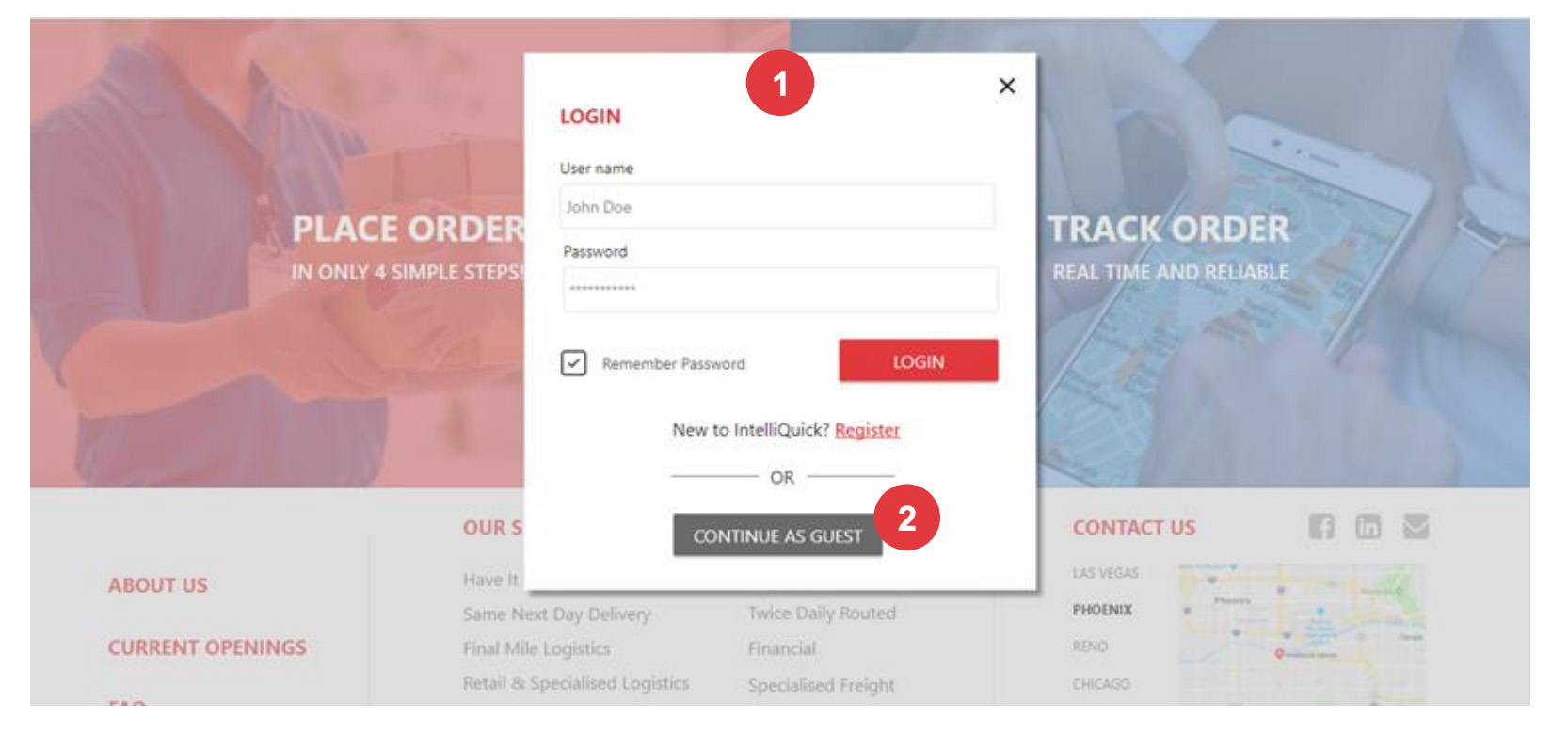
- Login/Signup comes as a popup, to remove the Login form from homescreen.
- User can also place order as a guest.
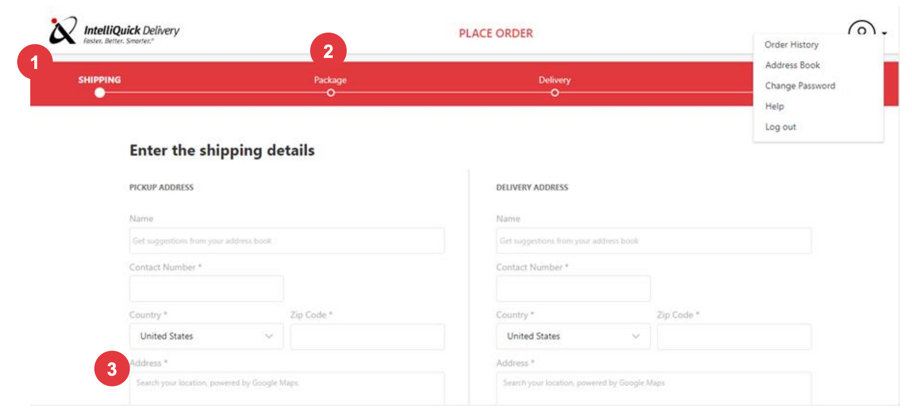
- Whole steps are divided into 4 steps
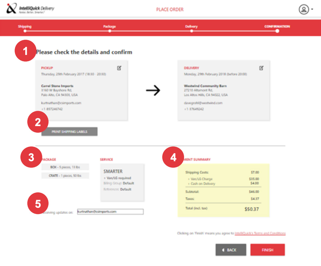
- Added progress bar, giving sense of completion to the user.
- Removed extra fields and merged Address field to one that searches from Google Maps
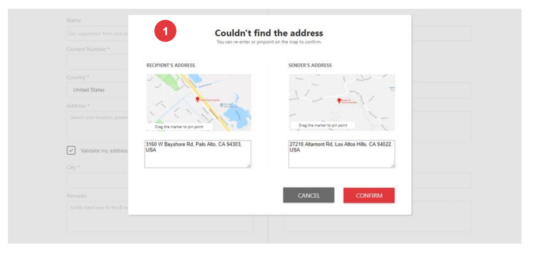
- If the system couldn’t validate the address, it will show this popup
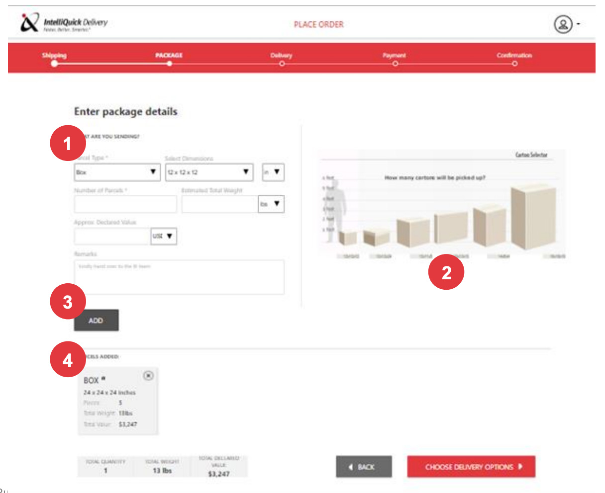
- Simplifying package details options with measurements options.
- Visual representation of the package dimensions to make it easy for the user to enter dimensions.
- Add button to add multiple packages if any
- Shows the different types of packages to be picked up. Below it shows total quantity and price.
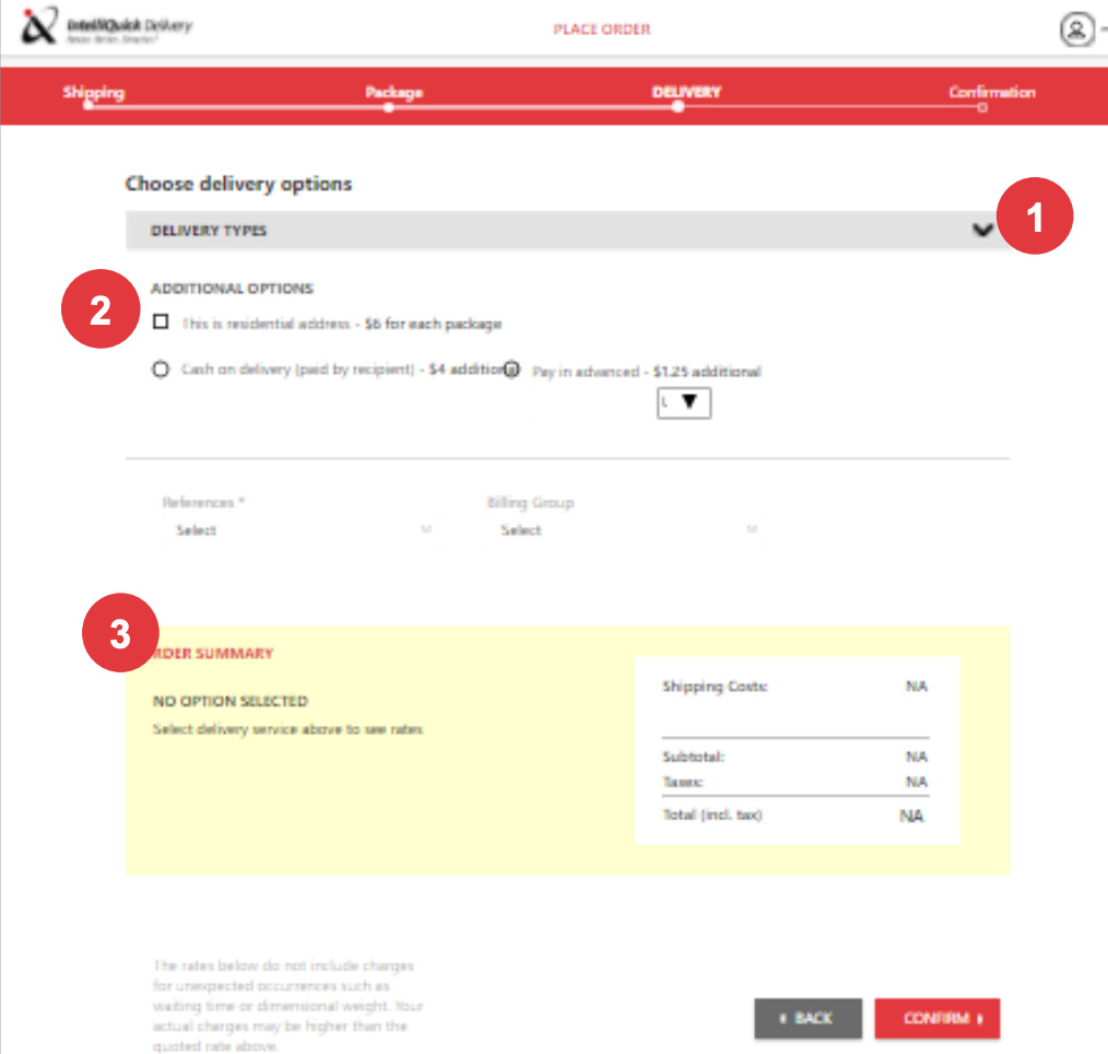
- All delivery options are in the collapsible
- The additional option are grouped differently, comes with additional prices that shows in bill summary below.
- Order Summary below shows the delivery options user have chosen above.
- Simplifying package details options with measurements options
- Visual representation of the package dimensions to make it easy for the user to enter dimensions.
- Add button to add multiple packages if any
- Shows the different types of packages to be picked up. Below it shows total quantity and price.

Case Studies
Nrusingh Charan Manik © 2025